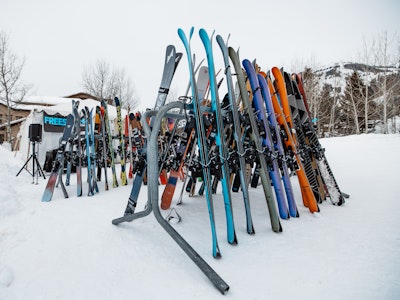
The annual FREESKIER Buyer’s Guide highlights the technical innovations that accompany each season’s batch of new skis. What often gets overlooked, however, are the aesthetics of each plank, specifically the hard work that goes into producing the eye-catching ski graphics. While artwork and topsheet visuals may not actually have anything to do with the performance of the ski, they certainly play a huge role in appealing to potential buyers. We can talk until we’re blue in the face about core construction, sidecuts, waist widths, camber profiles and taper, but in the end, there’s no denying that looks play a huge role in skiers’ purchasing decisions. For that reason, we polled the entire FREESKIER office to see which of this year’s editors’ picks were most pleasing to the eyes. Below are the top ten, in alphabetical order. Feel free to nominate your own personal picks in the comments section and vote in our poll below.
Read more about how FREESKIER tests skis.
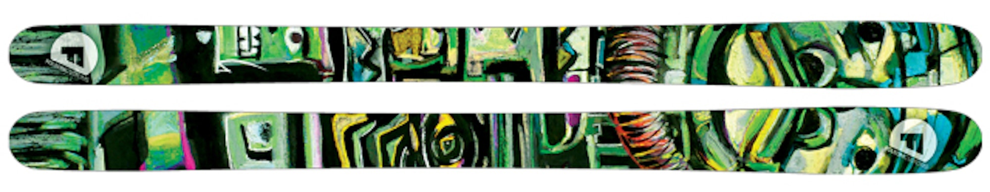
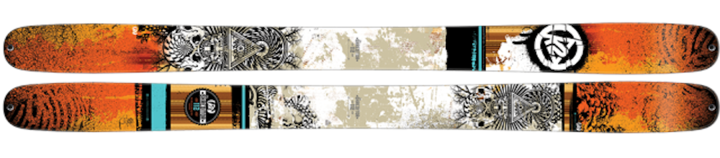
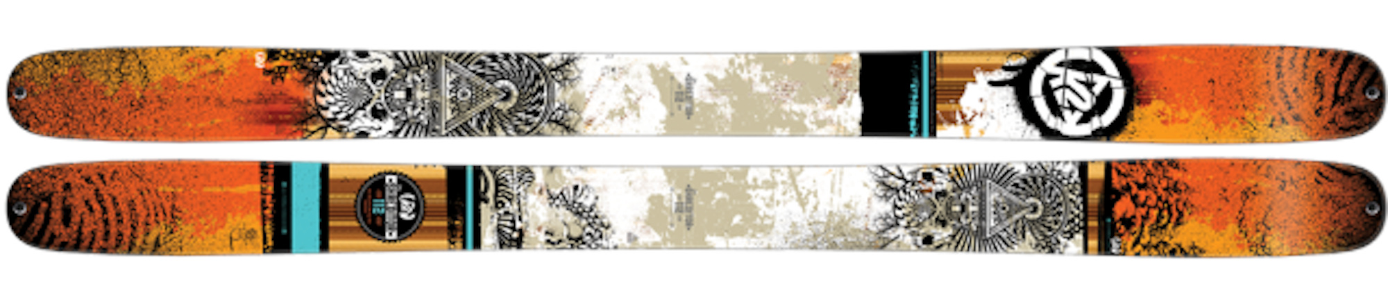
4FRNT Gaucho

Overall Score: 20.39
“The 4FRNT Gaucho skis garnered some serious praise from our testers including one that said, ‘it transitions seamlessly through variable’…” Click for full review and scores.
Armada JJ 2.0
Sebastian LaRose has been designing the graphics for the JJ since its inception seven years ago. According to Mackel Vaughn, Armada’s art director, a consistent theme of the JJ has been man versus nature and the thought of a dystopic future. The 2015 JJ 2.0 holds the theme of a “future so saturated with oil that we’ve poisoned our world with gases and smoke, represented by the green and yellow tones in the center and bottom of the skis,” says Vaughn. “The gas mask brings it together and makes the point even more tangible as a relation to the gases.”

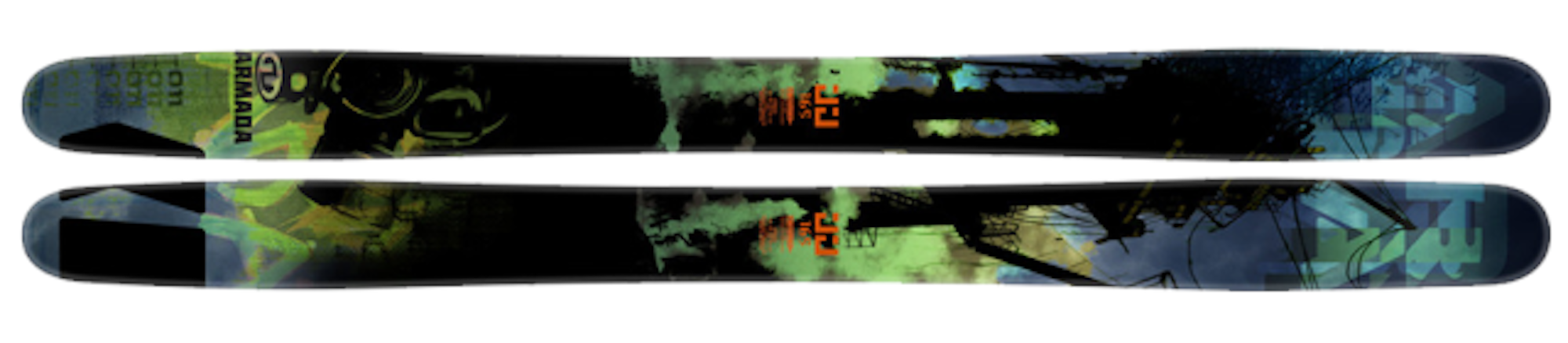
Overall Score: 21.36
“The Armada JJ 2.0 skis received an update along with rave reviews, this year. Modifications include a longer turn radius and a more gradual taper, equating to…” Click for full review and scores.
Atomic Bent Chetler
Since its first year of production during the 2009-10 ski season, the Atomic Bent Chetler has been a fan favorite for both its buttery playfulness as well as its eye-catching graphics, designed by Chris Benchetler himself. According to Benchetler, the inspiration for his artwork often comes from his passion for spending time in the outdoors. “If you look closely at the detailed line drawings [of the Bent Chetler], there are spine lines dripping into a barreling wave, mirrored into more spine lines, with tree-style totem poles surrounding an eyeball,” Benchetler says of the ski’s graphics. “All of those lines are overlaid on a matte black wood grain finish. I went in a much more tonal direction this year to ensure that this ski stood out amongst the other generations. As my career evolves, so does my art, and I wanted to create a more timeless piece.”
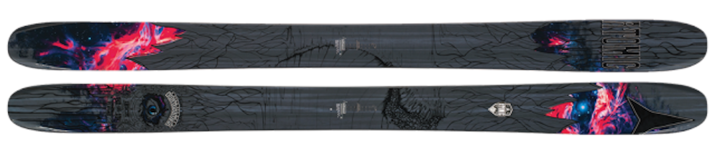

Overall Score: 20.38
“Chris Benchetler’s pro model got a major overhaul this year with the addition of angled ABS material in the tip and tail of the ski, similar to the hull…” Click for full review and scores.
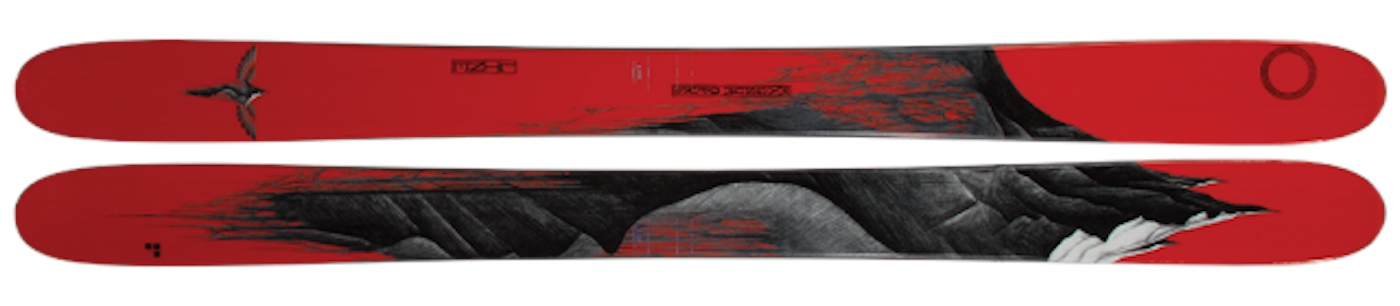
Folsom Completo
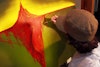
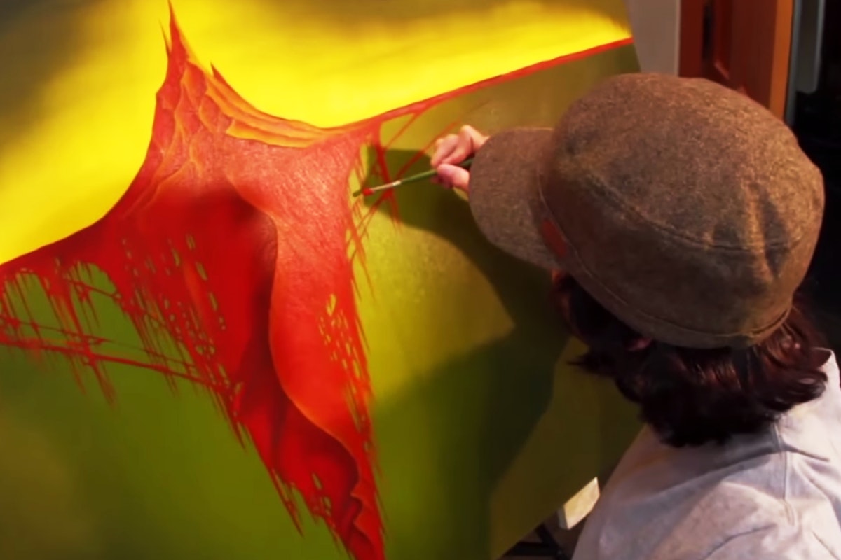
Denver, Colorado-based Folsom Skis enlisted the help of local artist Chris Adams for the graphics on the Completo, as well as a few other Folsom selections. The ski’s graphic was built off of Adams’ painting Oh Death, Won’t You Spare Me Over Another Year, which in turn is inspired by a 1904 photo from Edward Sherrif Curtis. With the painting, Adams adapted Curtis’ photograph by adding in color where he saw fit, in order to supplement the black and white of the original. According to Adams, “the figure in the picture is a woman from the Tlingit tribe, in her celebratory chilkat blanket. In her beautifully woven dress you can see symbols for the various animals that were important to the tribe’s welfare such as the boar, eagle, bear and squirrel. She wears a carved cedar mask with a woven vine necklace. When she would dance, the fringe at the bottom of the chilkat blanket would sway and ebb with her movements.” The original work is a six-foot by four-foot oil painting; prints can be ordered here.

Overall Score: 21.84
“Our testers found the Folsom Completo skiing perfecto in the fluff as well as the harder stuff. With an early taper tip and tail, and low camber underfoot, the ski’s flex…” Click for full review and scores.
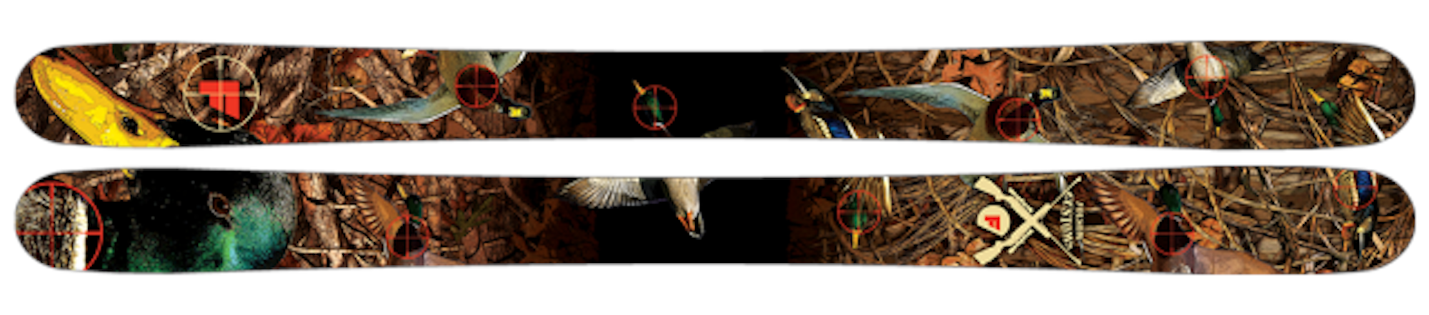
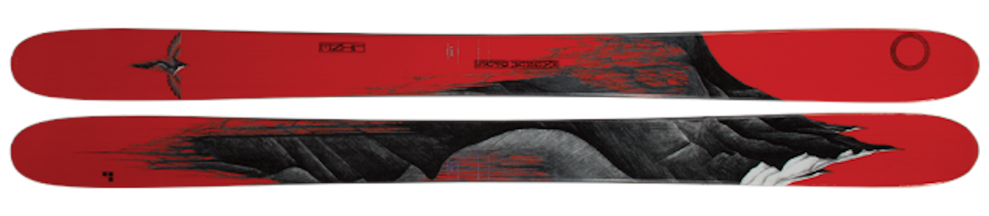
Folsom Trophy
The Trophy graphics were inspired by one of Ryan Prentice’s—Folsom’s sales and marketing guru—favorite childhood video games, Duck Hunt. Prentice notes, “with all of our Trophy graphics, I try to base them off some type of hunting experience, 2014’s ‘Trophy Buck‘ for example. Those mallards have their days numbered!”

Overall Score: 21.26
“Folsom’s quick and nimble powder tool, the Trophy features nearly symmetrical amounts of rocker in the tip and tail as well as early taper, to help you…” Click for full review and scores.
K2 Shreditor 112
The Shreditor 112’s trippy graphics come from a somewhat psychedelic source. According to Ryan Schmies, K2’s global ski graphics manager and designer of the topsheet, “I ate a bunch of cheese past its due date, hallucinated, locked myself in my room for a few hours and emerged with the graphic you see here. I celebrated with a Spotted Cow from New Glarus Brewing and sent it to the darkroom.”
Overall Score: 20.23
“It’s pretty much impossible not to have fun on the K2 Shreditor 112 skis. Rockered tip and tail with a moderate amount of camber underfoot allow you…” Click for full review and scores.
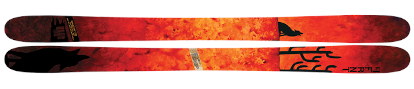
Liberty Skis Origin
The inspiritation for the howling coyote graphic on the Liberty Origin came from a night spent on the Rose Bowl deck at Beaver Creek Resort in Colorado. According to Liberty’s creative director Shannon Kennedy, “we watched the full moon rise over the Gore Range. This ski is as fun as they come and the coyote is a tribute to the hooting and hollering of all the blissful skiers on a pow day. This was also the inspiration for the name ‘Origin,’ as it brings us back to pure fun at the heart of skiing.”

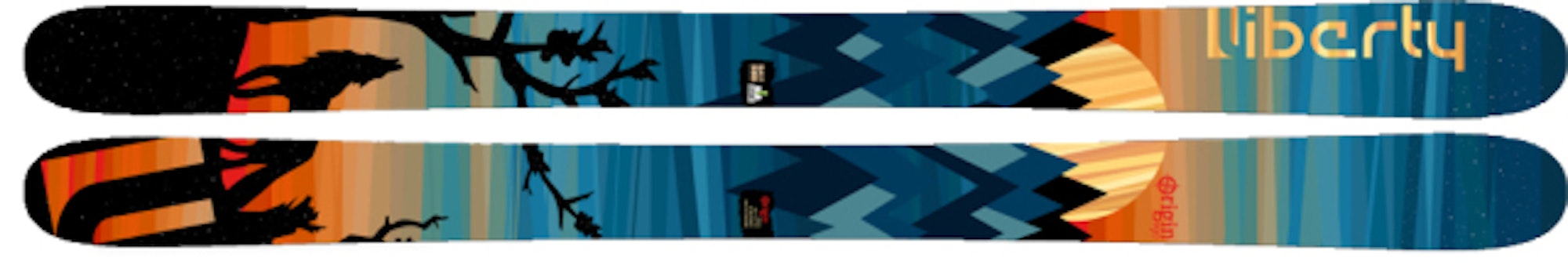
Overall Score: 21.60
“The Liberty Origin skis had our testers howling all across Aspen Mountain, and it wasn’t just because of that snazzy coyote topsheet. ‘These skis…” Click for full review and scores.
Line Chronic
According Josh Malczyk, global brand director for Line Skis, the Chronic is the go-to ski for the majority of the brand’s athletes including recent signee Tom Wallisch. As such, the ski has always had a graphic that stands out amongst the crowd on the hill. For 2015, Line tapped the skills of Derek Muscat, who came up with the dual prowling tigers on the topsheet. “He said he’d always wanted to do this type of composition and came up with the neon, fierce-as-hell tiger, inspired by velvet black light posters,” explains Malczyk. “Too bad velvet doesn’t make a good top sheet material, or we would have put that on there too.”
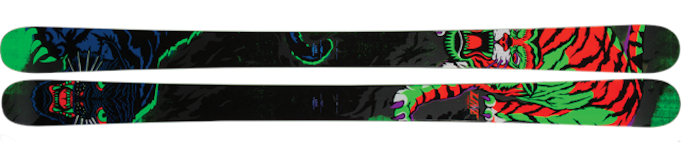

Overall Score: 21.33
“Like Dr. Dre’s album of the same name, the Line Chronic skis are a classic. It’s constructed with an aspen wood core to add pop and subtract weight…” Click for full review and scores.
Line Magnum Opus
The graphics for the Line Magnum Opus were taken from the artwork of Eric Pollard, who was the brain behind the ski’s design. According to Pollard, “I grew up in the northwest, near a lot of volcanoes. Each one is a lone peak, typically a white cone, surrounded by green foothills; a very different looking mountain than a range.” The work used in the Magnum Opus is inspired by Pollard’s home mountain, Mount Hood. Pollard adds that “a lot of my work is based on macrocosm and microcosm relationships; I’ve done a few series of trees and imagined root systems in the past. With the Magnum Opus graphic, I thought it would be very cool to draw an imagined ‘root system’ for a mountain in much the same way I had done before with trees. I pulled some influence from icebergs, where 10 percent is above the water and 90 percent is below the water.” The medium for the original work of art was just good ol’ paper and pencil.
Overall Score: 19.13
“From the mind of Eric Pollard, comes the all-new Line Magnum Opus, a floatier version of the wildly popular Mr. Pollard’s Opus. The waist width was…” Click for full review and scores.
Ski Logik Powder Ball
The “Raven Spirit” graphic displayed on the Ski Logik Powder Ball was created by the brand’s art director Mariella Mazzarella. According to Mazzarella, the Raven is a sacred bird to Native Americans. She gained inspiration for the artwork while sitting on the edge of a cliff in the Grand Canyon, watching a flock of ravens “engaging in acrobatic flight and communal sounds. They dominated the sky and I was taken by their creative agility amidst the power of the place,” she says. When it came time to place the image on the skis, Mazzarella “wanted the spirit of the raven to be as big as possible, its power looming on the entirety of the skis, even with its claw on full display.” Mazzarella goes on to say that she “positioned its head so its gaze is constantly pointed at the skier in a benevolent and protective way. I wanted this connection between the raven and the skier to be the main focus of the art. To enhance this effect, I used mother of pearl in the pupil of the raven. In admiration to the raven’s fluid motion of flight, I draped feathers along the whole length of the skis.” An inspiring graphic, indeed.
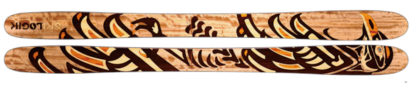
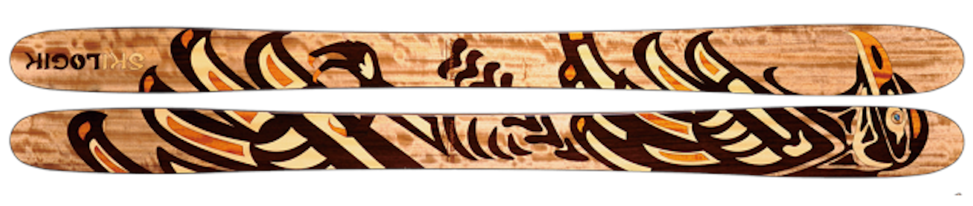
Overall Score: 19.01
“Like its name suggests, the Ski Logik Powder Ball skis are meant to surf the deep stuff. Ample tip and tail rocker combined with a flex…” Click for full review and scores.
[poll id=”100″]
![[GIVEAWAY] Win a Head-to-Toe Ski Setup from IFSA](https://www.datocms-assets.com/163516/1765920344-ifsa.jpg?w=200&h=200&fit=crop)
![[GIVEAWAY] Win a Legendary Ski Trip with Icelantic's Road to the Rocks](https://www.datocms-assets.com/163516/1765233064-r2r26_freeskier_leaderboard1.jpg?w=200&h=200&fit=crop)

![[GIVEAWAY] Win a Legendary Ski Trip with Icelantic's Road to the Rocks](https://www.datocms-assets.com/163516/1765233064-r2r26_freeskier_leaderboard1.jpg?auto=format&w=400&h=300&fit=crop&crop=faces,entropy)

![[GIVEAWAY] Win a Head-to-Toe Ski Setup from IFSA](https://www.datocms-assets.com/163516/1765920344-ifsa.jpg?auto=format&w=400&h=300&fit=crop&crop=faces,entropy)