INTERVIEW — Jake Stern
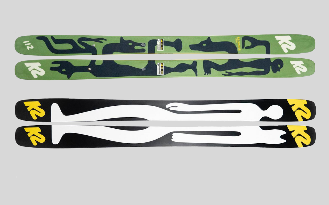
Even though he spent his childhood in Calgary, Alberta, Geoff McFetridge never skied a powder day until he moved to Los Angeles to attend school at CalArts. Maybe that’s why the renowned artist and graphic designer was drawn back to the ski world. McFetridge was born at the dawn of snowboarding and rode that wave on the back of the skate scene, his first love. But the freestyle explosion at the turn of the millennium, driven by fellow Canucks in the New Canadian Air Force brought him back to skiing’s promised land. Since then, McFetridge has blazed a trail through both the commercial and art worlds, and his latest collaboration with K2 brought us one of the most creative topsheet designs we’ve seen in years. We sat down to speak with McFetridge about his limited edition K2 Reckoner 112 skis, and why Mount Baldy skis better than Lake Louise. Well, maybe just the first part.
Tell us a little about growing up in Western Canada and your path to becoming an artist.
I grew up in Calgary, Alberta, close to the mountains. I started skiing when I was three-years-old because we had a ski club in Edmonton, and we rode at a local ski hill in the city. I came to art through skateboarding and then being around for the rise of snowboarding. When a new sport is invented, people start clothing lines and open shops. I was sponsored by [a local] shop for skateboarding and I’d create t-shirts for them. When a friend of mine went pro as a snowboarder, I started doing his graphics. So, as much as I was making art, I saw art as a vehicle for doing work for my world or my culture in a very simple way. But I needed a way to progress. I didn’t know how to break out from that. So, I moved to Los Angeles to study at CalArts.
How did you transition to the professional art world?
The biggest break I had was working with the Beastie Boys. This was in the mid-nineties. I started returning to my interests—the surf and skate stuff—but the commercial work didn’t feel like a fit for life. I started lining up tons of work after the Beastie Boys and I began to [blend] my commercial work with my more art-based design practice that I developed in grad school, and that really began to take off. I was doing client work for MTV and Pepsi, but still holding art shows. Then it just became very fluid and natural.
How does your identity as former skater, snowboarder and, now, a skier shape your work?
I snowboarded until maybe 2000 or so. I came back to skiing once [freeskiing took off]—that’s when I put away the snowboarding stuff. I have this idea that my art practice is contaminated by projects and commercial work, that it bleeds in. But the commercial work also pursues these conceits of art. At the same time, I’m interested in how I can bring my other interests and pursuits outside of my work into the studio, which means skiing is important in the studio, and so is being a skater and a father.
How has living in LA been, as a skier?
I love Mount Baldy. My studio is on the East side, very close to the Angeles National Forest and pretty close to Baldy. Skiing Baldy during the years that I’ve been here has really opened me up to the wild skiing here, especially the backcountry zones. Mammoth is my home mountain, by the numbers, but I think Baldy is really magical. I’ve been lucky to get a few really good years and, when it turns on, it’s like nothing else. Even though I grew up in Canada, I don’t remember ever skiing powder. Maybe a little bit when I was snowboarding. So, Baldy was really a turning point for my skiing, and the San Gabriel mountains are really serious—you have to have a really strong knowledge base and be very flexible to explore the backcountry around here.


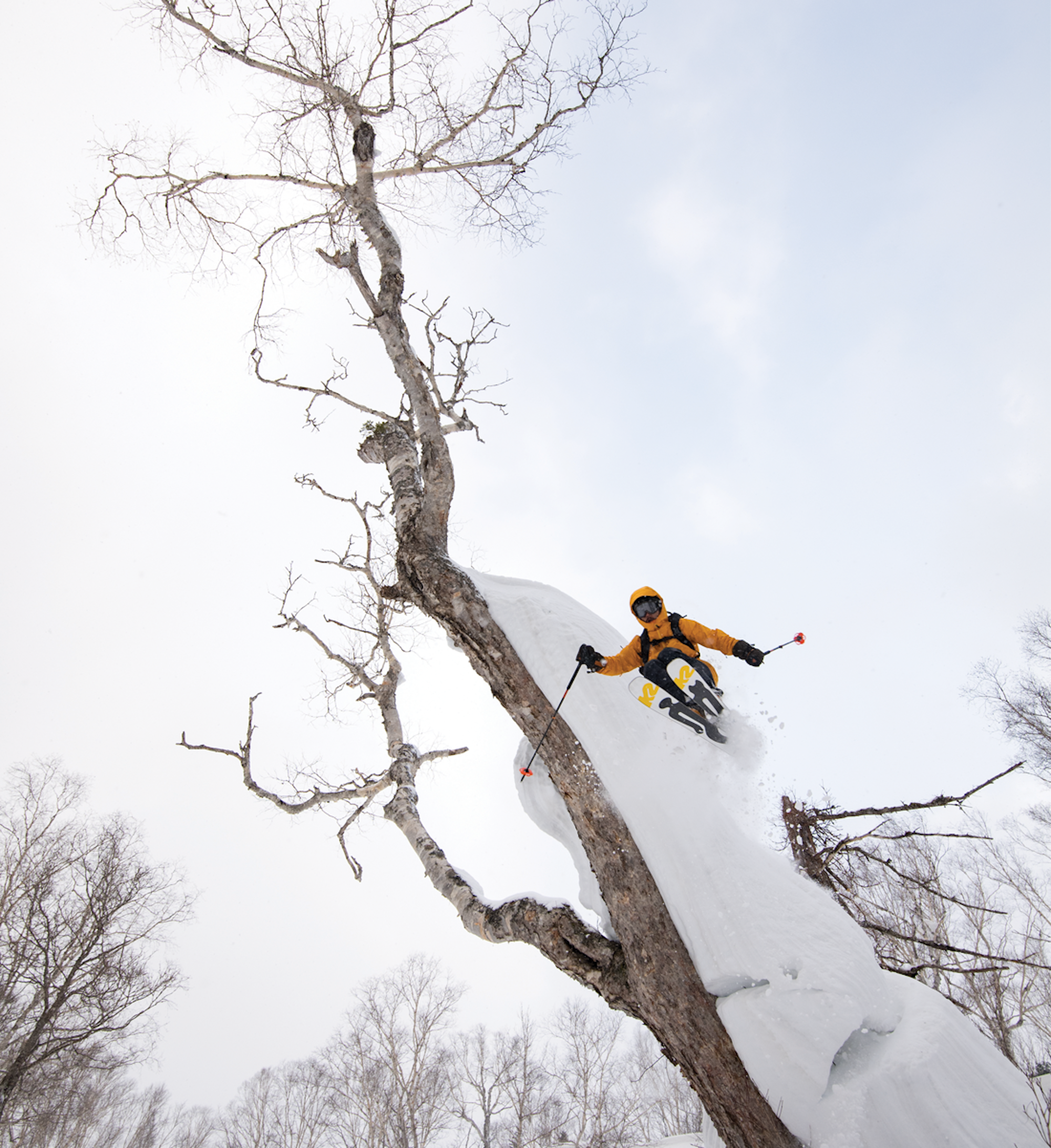
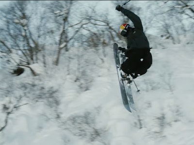
SKIER: Hirofumi Ishikawan
PHOTO: Takahiro Nakashiri
LOCATION: Hokkaido, JPN
How does skiing influence your work outside of designing topsheets?
I love exploring greater themes of using images or using text in my work to talk about exploration, or even the alienated individualism in alpine sports. I’ve been experimenting with images of generic Everest mountaineers who use supplemental oxygen. They’re very familiar, but I like using them out of context. They are characters who are maybe over-prepared for a mission that has more to do with ego and actual self-understanding. Skiers are funny that way.
Was it difficult to break into the ski industry?
Skiing really became one of those things that I wanted to do, but I kept getting offered snowboard projects. Salomon would say, “Hey would you do a snowboard?” And I would take the project because I thought: This is my chance to break into skiing. Skiing was the most difficult thing to crack because I discovered that the ski department in each larger brand was totally fire-walled from any other aspect of company. I wasn’t meeting people in the ski world, and I didn’t have any connections. The K2 project was a big deal for that reason alone. It felt like such a breakthrough.
How did your collaboration with K2 come to be?
K2 brought in a new creative team recently and they asked if I’d be willing to design a whole collection: a touring ski, powder ski, snowboard, apparel, a boot and a pole—do everything. I was super psyched because it’s the kind of project that I would have designed for myself. Eventually the snowboard team backed out and we ended up just making a touring ski [the Wayback 96] and a wider, big-mountain ski [the Reckoner 112]. I think it mattered that I skied, that I’m a skier. I would be uncomfortable doing a rock climbing shoe. I would never do that because I’ve never been a serious rock climber. I keep myself at least in the realm of stuff I’m into.
Did the shape or style of the Reckoner 112 influence the design that you created for it or did you have a design in-mind regardless of the shape of the ski?
I actually skied that ski all last year. It’s really an amazing ski and I designed [the graphics specifically] for that shape. The overall idea was really about being changed by experiences in the mountains. I used these images of human forms turning into animal forms, melting together to illustrate our connection to nature. So much of skiing is about that: It’s about building that connection between your mind and your body to make these subtle changes or adaptations as you learn or pursue new terrain. And it’s all happening very fast. The crazy thing about ski technology now is that you don’t even think about your skis because they’re just there for you. It’s almost like they disappear. So, I felt like that melting of human and animal was really appropriate for that ski.
Where do you draw inspiration from for your work in the art world and beyond?
For me, everything is rooted in drawing. There’s a fluidity into everything I draw and I think that really does come from classical drawing. It’s rooted in etching where you do a single line, or very quick studies. The people who mastered that are artists like Matisse, Picasso or David Hockney. But I also draw a lot of inspiration from children’s books [authors and illustrators] like Richard Scarry and Maurice Sendak. I’m also trying to draw in a way that’s anonymous.
What’s unique about creating artwork for ski topsheets from a design perspective?
They’re just so weird. It’s the worst shape ever from a design perspective. Like designing chopsticks—I haven’t experienced anything worse. I was lucky that K2 was willing to do an A and B topsheet, to create a whole image. I don’t know what it means cost-wise, but it’s not good. And I ski telemark, so I have a left and a right ski.
It’s super interesting, too, to work with the constraints of skis, and find out what’s possible production-wise.
What kind of topsheet art did you admire growing up and, in your opinion, what makes your design for the Reckoner 112 stand out?
I really love simple, vintage skis. It’s cool to track topsheets through their marketing eras. First, you had pre-marketing wood skis that people made in their homes. Later, there were the skis with the Madison Avenue marketing feel to them that were still simple, but with loud stripes and colors. Now, skis have a kind of supermarket-style, image-based feel to them. I think it’s interesting to think about how skiing is always [balancing] art versus commerce. How obvious are we going to be? Should we make our design all about the brand? And I think all of those things are viable… but, at the same time, if I’m going to do a limited-edition ski, it’s not really the place to be super quiet. It’s a chance to be loud, to tell a story by creating something that is alien to the ski world and stands out because it’s unexpected.
![[TOPSHEET] A conversation with artist Geoff McFetridge](https://www.datocms-assets.com/163516/1751489178-topsheet_feat.png?auto=format&bg=FFFFFF&w=100)
![[TOPSHEET] A conversation with artist Geoff McFetridge](https://www.datocms-assets.com/163516/1751489178-topsheet_feat.png?auto=format&bg=FFFFFF&w=1200)
![[GIVEAWAY] Win a Head-to-Toe Ski Setup from IFSA](https://www.datocms-assets.com/163516/1765920344-ifsa.jpg?w=200&h=200&fit=crop)
![[GIVEAWAY] Win a Legendary Ski Trip with Icelantic's Road to the Rocks](https://www.datocms-assets.com/163516/1765233064-r2r26_freeskier_leaderboard1.jpg?w=200&h=200&fit=crop)
![[GIVEAWAY] Win a Legendary Ski Trip with Icelantic's Road to the Rocks](https://www.datocms-assets.com/163516/1765233064-r2r26_freeskier_leaderboard1.jpg?auto=format&w=400&h=300&fit=crop&crop=faces,entropy)

![[GIVEAWAY] Win a Head-to-Toe Ski Setup from IFSA](https://www.datocms-assets.com/163516/1765920344-ifsa.jpg?auto=format&w=400&h=300&fit=crop&crop=faces,entropy)
![[TOPSHEET] A conversation with artist Geoff McFetridge](https://www.datocms-assets.com/163516/1751489178-topsheet_feat.png?auto=format&bg=FFFFFF&w=2000)